Jaspreet Singh
Jaspreet Singh has 15 years of experience in the Digital Marketing industry and also running two international companies, SEO Corporation and Hemp Organisation.
Every day, we are bombarded with a deluge of information online. In the virtual world, everyone’s an expert and has a story...

Image Credits: pixabay
Every day, we are bombarded with a deluge of information online. In the virtual world, everyone’s an expert and has a story to tell. This creative expression produces a massive amount of data every second. We as content creators face the insurmountable task of attracting readers to our content, guiding them through, keeping them engaged and then getting them to subscribe or buy.
Not everyone has enough time or the appropriate attention span to read miles of text. You need signposts and visual clues to keep them skimming through the content while still deriving valuable information and helping break the monotony.
Unfortunately, very little information is available about the importance of visual clues in a blog.
Think of visual clues like stepping stones in a shallow stream. What is their purpose?
Help you cross the stream.
Blogs and articles online are like these streams that people have difficulty crossing if you don’t put the stepping stones there. While none will really drown in a shallow stream they won’t cross it without the stepping stones. Very few will be willing to get their feet drenched and cross the stream with no help.
People visiting your blog but not reading it are the ones who need stepping stones to consume the information from your blogs and articles.
And if you make the stepping stones pretty, people will cross the stream for the sake of it.
Let me help you understand the idea with this simpler version here:
Even though long-form content is a search engine favourite, a lot of people find it tiresome. The common complaint: too long, didn’t read.
The worst fate that your writing could suffer is to get bookmarked and forgotten. Sadly, this happens a lot.
Expecting visitors to flock to your 3000+ words guide is insane and reading it all the way to the end is purely unrealistic.
As a blogger and writer, you should be focused on helping your readers get the most out of your blog/article without getting bored. This is where visual clues enter the picture.
You want your readers to grow attracted to your blogs through these visuals and grasp the most important information as soon as they look at the blog.
The long length of your writing and exhaustive nature may scare some writers but if you employ visual clues right, they will work like stepping stones, helping readers consume the information without getting stuck or drenched in the stream.
Suggested:
How long should a blog post be?
To help your readers comprehend your blogs better, you need to leave them visual clues. Sometimes, people just click on a link to view the featured photographs/images so you may as well end up increasing your click-through rate. The focus of your content should be to help your readers gain the valuable information they were looking for.
Adding Visual clues will help your readers skim through and still get the information they need.
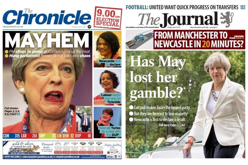
Take the classic newspapers for example.
Ever given a thought to their news formatting and presentation style?
If you didn’t, it is time you did.
The best way of presenting your content using visual clues is by highlighting the critical and moving parts of the story. You should always start by highlighting your title because that is the first thing that any reader will read the minute they visit your blog.
The responsibility of bringing that visitor to a particular blog/story lies solely on the featured image and your title. So, make them both very catchy, crisp and intriguing.
No need to give out the whole plot in the title. Just compose your title to intrigue and capture attention. Your title should thrill, surprise, shock, amuse and evoke curiosity from the reader.
Other than deciding the perfect headline, you should pick the right font size for your title.
Newspapers often chronicle tragedies but have you ever noticed how they titillate the reader’s attention with a featured photograph?
You don’t have to start writing tragedies or romances to generate attention but simply emulate the classic practice of including a featured photo in a written piece.
A relevant featured photo has also become a common practice among famous blogs online. A lot of writers follow the promising title with a spot-on introduction with a featured photo right next to it. When picking your featured photo, make sure that it supports the title.
The benefit of having a featured photo right next to the opening content is that the words per line will reduce and readers will find it particularly easy to read them. Moreover, readers will process the photo much faster and move forward depending on how spot-on was the image. You must understand the importance of images in the post.
Not breaking your content down into small, digestible chunks is plain torture. The quality of your writing won’t matter much if you don’t format it well.
Always break your content down into small paragraphs complete with apt headings and bullet points and a conclusion that summarizes it all.

Focus on packing information in such a way that your readers consume the information as they come across it instead of procrastinating.
Ever noticed how newspapers have a major quote printed right in the middle of a story? This is done to evoke a response and boost the human-engagement factor of the piece. People tend to read quotes more and they consume small content that’s highlighted in a story faster than they consume the entire story.

Try highlighting expert or critical quotes in your blogs and articles along with information of great importance.
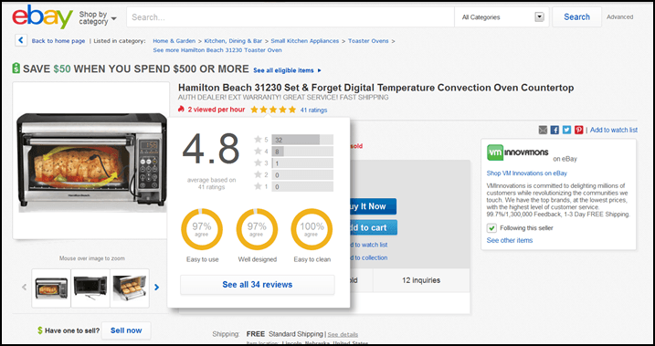
When researching topics, you may come across information that may not blend with the tone of your blog/article. But if you feel it’s crucial, you can present it separately in simple data batches.
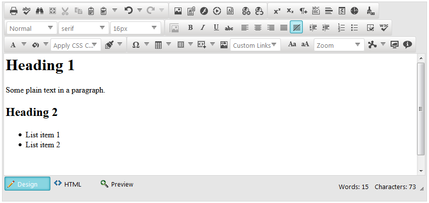
Just make separate columns, use a different colour theme and highlight them so they don’t get ignored.
It’s good to be a writer with a passion but to grow your blog’s engagement, focus on being a storyteller. Tell people not just what they want to hear but also what will help them get ahead.
Storytelling is incomplete without some vivid imagery so don’t forget to craft clever, creative and intriguing captions when you support your blogs (stories) with real images.
A lot of people just browse through images and writing clever and descriptive captions can help you get their attention to your blog.
Visual content: Improve your content consumption with visuals.

Use a big, attention-grabbing, relevant image right under your title and before you begin writing the opening of your blog. Since it is the featured image, you can choose one as wide as your post but if you want to feature the opening or introduction alongside the featured image, you can resize the image and use it on the right or left-hand side with the introduction content right next to it.
Using the featured image right next to the introduction or opening will also help your readers comprehend the information better.
Allow your readers a brief break every 300 words by including images at specific intervals. If your blog is only 300-500 words, only one image will do. But if you have written 500+ words, consider using images every 300 words. Keep the content/blog theme and topic in mind and use relevant, informative, easy to comprehend images.
Unless you are documenting original research and contributing to the revered journals in science and technology, it is best to customize your content to fit your reader’s needs. Engagement depends largely on how easy your content is to consume in addition to relevancy. Just in case I lost you at the original, here are the Key takeaways:
Just focus on bringing value to your readers when writing and making it easy for them to consume and process the content if you want your audience to grow.
Thank you so much ….this is such a statuesque post for audience engaging motive.
Very appreciable effort. Above mentioned points makes flow of continuously post reading.
Hi Vishal,
Good post with great suggestions. Sharing the right kind of pictures along with good content makes your post stand out. It creates a bit of interest among your visitors and holds them up to read your full content.
Thanks for sharing this post. keep up the good work. 🙂
Hi Vishal,
What an amazing post. You have explained things in so much details. Images are so important to keep your visitors engaged. Your suggestions are gold to any blogger.
Thank you for sharing, have a good day. 🙂
Very good article and nice website dude…