It is a proven fact that it takes only a tenth of a second to make a first impression. Whether it is for a new job or in front of your significant other’s parents or in front of a customer. You will never get a second chance to make the right impression if you did not make a proper first impression.
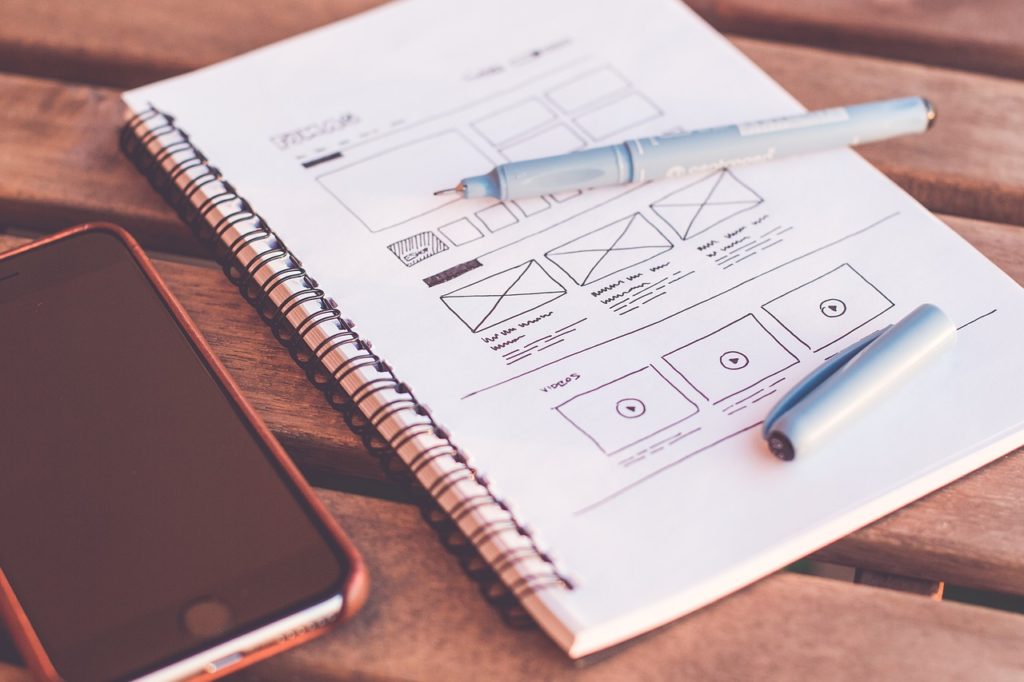
Today, most people consider looking at your official website rather than going personally to the outlet for which it is necessary for any business owner to make the right first impression in web design. 94% of first impressions of a brand’s website relate to its design.
Your business website can depend on two primary factors on which you can make or break your reputation. These aspects include the technical aspect and the artistic aspect. Perfect web design can only be formed when these two aspects of designing go hand in hand.
Making a strong first impression
One of the basic things that a web designer should keep in mind is the nature of the industry the business belongs. Some of the necessary things you need to have on the website to make a perfect first impression are:
- Easy navigation of your site.
- Add a call to action.
- Speak directly with the mind of the people.
- Add pleasing images.
These four things are necessary to make a positive impression on the masses with your web design. If you still do not understand, a little more description can ease out the problem.
Clear navigation
Clear navigation or an easy approach to your link can generate more traffic to your website and increase your rating on various search engines. Broken links and hidden menus can result in driving away your website traffic and potential customers.
You have to make sure that your web design has appropriate and easy access to the menu and inside website links for the visitors. There are three main menu bars that you can choose from.
This menu bar is at the top of the web page. It is clear and has the link to all the essential pages of your website. For example, if you are an architect, you can add the “about us” page, the portfolio link of all your work, the main services page that you provide, and the contact page that compels the customers to get in contact with you.
This menu bar only appears when a visitor clicks on the button. This type of menu is great if you want a sleek design for your menu bar. However, the menu bar click button needs to be very clear so it can easily be seen.
It doesn’t matter what type of menu bar you choose for the very top of the web page, but a footer menu is necessary for web design. Doing this will allow the visitors to easily navigate through the different pages to find the necessary information they require.
Call to action
Adding a call to action guides the customers about what has to be done after they have got all the information about a particular business. They move the users a little deeper into the website helping you to generate leads.
Adding additional fonts and vibrant colors to the CTA at your site can turn off the users. So avoid using ostentatious designs and make them a bit unique. Two important things for you to keep in mind while making a CTA is
Unclear language can mislead the user. When clicking on the CTA, it should take the user precisely to the page where a CTA is meant to take.
Do not use overly used texts like “click here” as a call-to-action text. Instead, customize the CTA text in such a way that you are letting the visitor know accurately what they want.
Adding an interesting CTA is likely to get more visitors to your website plus you’ll end up making a perfect first impression in web design.
Give appropriate message
A visitor would never want to start by reading texts only. They want more visuals than text. Therefore, it is appropriate to start with the proper heading and bullet points leading to the message you want to convey about your business to your customers.
For this, you need to understand what message you really want to give to your audience. Then craft a perfect draft with headlines and subheadlines explaining to the customers what you want to say.
Remember that your content needs to be sweet and straightforward written in simple language. Your call to action is what supports and leads the customer further with their decision. Supporting content is enough to navigate the customers through the web page.
Add pleasing images
Adding pleasing images doesn’t mean adding anything that is pretty and beautiful but pictures that are related to your website and your business.
Your web page needs to be pleasing to the customers. Therefore, everything needs to be linked to each other including the images that you are incorporating into your web design. Take the example of an event designer. The images of the web design should be of the events that have been planned by her and not of buildings.
Similarly, it is essential for your logo to be the representative image of your company. Creating a logo from a free logo creator online might just do the work.
Psychology induced in web designing
Nowadays, web designers have adopted a psychological approach to generate more revenue by making a subconscious impression on the audience. Designing a webpage with a psychological impression means developing from the audience’s view.
There are many psychological factors that can compel the visitor to make immediate action. Here are some discussed in detail
Establishing trust and confidence
If you want your customers to behave as per your expectations, they need to develop a trusting relationship with you. Therefore, developing trust among your users should be first on your priority list.
With the increasing number of digital scams and crimes, it is not easy for anybody to develop trust. People do not like when different websites ask for the user’s email address and stuff before they can even figure out what the business is about. Make sure that your web design does not include anything as such.
As mentioned above it takes only seconds to make an impression and ultimately gain the trust of the visitor. Put your customer at ease with easy access to your website.
Emotional psychology
Colors and fonts evoke the emotions of the customers. Choosing the right colors in your logo can act as a valuable tool for influencing a visitor. Every color has different emotional psychology that evokes a different emotion rooted deep in the subconscious of a human mind.
A logo is what makes helps in making the right first impression. Creating a logo from designing your own logo for free might help you in creating the logos for free and generate the right amount of traffic for your website.
Pattern consistency
The human brain functions to recognize patterns. Be it in the form of colors or page layout; it can be used to benefit your business in a certain way. A designer’s job main is to maintain the specifics of your brand by incorporating these specifics into the webpage design.
The conclusion
In a nutshell, it is crucial for a web designer to create a web design that doesn’t only attracts the right amount of traffic but also delivers the right message to the visitors. Knowing human psychology while designing a web layout might be helpful in benefitting the business.
Like this:
Like Loading...







 Should Beginner Bloggers Start Off With Free Hosting Packages?
People make snap judgments. It takes only 1/10th of a second to form a first impression about a person. This first impression depends on many factors: structure, colours, spacing, symmetry, amount of text, fonts, and more. The content has superiorly described the specifics.
You will never inspire another opportunity to establish the correct connection on the off chance that you didn’t establish an appropriate first connection. Today, a great many people consider taking a gander at your official site instead of going by and by to the outlet for which it is essential for any entrepreneur to establish the correct first connection in website composition. Your business site can rely upon two essential factors on which you can represent the moment of truth your notoriety. These viewpoints incorporate the specialized perspective and the creative angle. Flawless website composition must be framed when these two parts of structuring go inseparably.
Hi Robin,
Nice post .thanks for sharing.