Robin Khokhar
Robin Khokhar is an SEO specialist who mostly writes on SEO. Thus sharing tips and tricks related to SEO, WordPress, blogging, and digital marketing, and related topics.
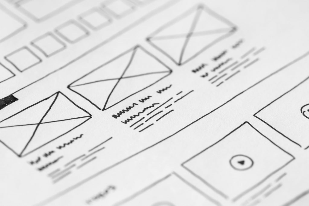
A wireframe of a website is also referred to as a screen blueprint, which makes up the very foundation of web design....

Image Credits: pexels
A wireframe of a website is also referred to as a screen blueprint, which makes up the very foundation of web design. Why do you need to create a wireframe? It is used to arrange elements, like textual data (titles, headings, the body of blog or article), videos, and images to create the best layout for your website. All of these website elements should seamlessly work together while looking functional and appealing to online users so you can achieve your website goals.
In this post, you’ll learn how to create a wireframe for your website, which serves as your quick reference.
Wireframes focus on what the screen does far beyond the aesthetic appeal, as these are created for enhanced user experience. Creating a wireframe focuses on prioritizing information and website functions, creating rules for displaying information, and effects on how different scenarios will be shown on the screen.
When contemplating the wireframe creation process, you need to decide on the best method you should choose. Here are the different methods available:
Free wireframe tools are available to help you create wireframes and prototypes. So, you can experiment with plenty of wireframes to choose the best one for your website.
As mentioned, a wireframe is a visual aid for you to determine the best layout of your website page. It ensures that the questions of all users are answered when it comes to your purpose of creating such a website. Wireframes avoid unpredictable elements, like boxes or buttons in unexpected places.
So how many screens do you need to produce? What should comprise your information architecture? Good information architecture promotes user self-sufficiency, reduces or eliminates user frustration, and keeps visitors from leaving your site. It would mean more sales and benefits for your website and your business.
Once you have a great user flow with great collaboration and your screens are ready, it’s time to add details so you can upgrade your wireframe to prototype-mode. So how do you add muscles or a body to your wireframe or website’s skeleton?
Here are some details you can include:
When creating wireframes for your website, it’s important to start from scratch. While you can use a pencil and paper or a whiteboard to make changes easier, wireframing tools are available to add more details. Collaboration and mapping out the user flow are important to create the best wireframes and prototypes for your website. Finally, don’t forget to test your design and add more details as necessary to finalize your wireframe design.