Hermit Chawla
Hermit Chawla is a Marketing Manager at Sprak Design. He would love to share thoughts on best Facebook post design, Lifestyle Design, Branding Firm, Exhibition design, etc..
Attractive and eye-soothing graphics are probably the best to catch someone’s attention in mere seconds. That is the reason why every form...

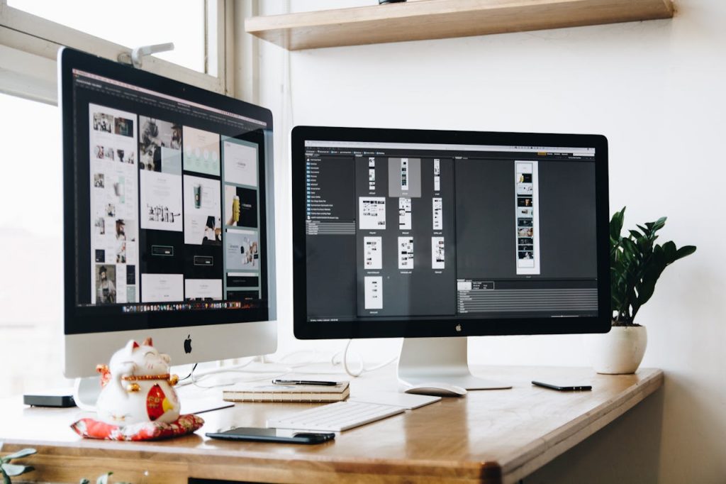
Image Credits: pexels
Attractive and eye-soothing graphics are probably the best to catch someone’s attention in mere seconds. That is the reason why every form of marketing and advertising includes the use of stunning graphics. Even social media has become the hub of good looking graphics and graphic design be it pictures, a small video, or a full-fledged video, it houses them all. This has made top social media post designers a busy time while making these platforms (like Instagram, Facebook, Reddit, etc) the best online platform for marketing.
Well, to put it simply the only reason why graphics designers work so hard to create such unique and stunning graphics is to promote engagement and to attract new to the platform or the entity those graphics is been made for. As astounding as it may sound, but people receive about 90 percent of the information transmitted to the brain through visuals. So, now you understand why it is so important to add graphics to your social media.Â
But, how and where can you find the best graphic design for your business or for the intended market campaign?
One thing is for certain that creating graphics is not an easy task, apart from this the design you are choosing must resonate with your brand, products, and services. This is not something you can do yourself, so we would recommend you hire a social media post designer, that would bring to you the perfect design for your business. However, you also need to aware of the ups and downs of graphic design you are going to use on your official social media account and so here are the 7 best Wonderful Design Tips For Social Media.
Color is an important aspect of the social media design post, as it can highly influence the users in a good or a bad way. Colors help to set the mood and create an atmosphere, convey the right emotions to the viewers.
Everyone on social media tends to just randomly scroll through the posts, it’s your duty as a graphic designer to create designs that could act a breaker in that constant scrolling motion. As it turns in the overall graphic design a good color scheme can trigger a 90 percent snap judgment in your favor. So, if you have an engaging color scheme chances are that you would be able to attract more audiences than you normally could.
Even the basics graphic design includes a number of components like pattern, color scheme, contrast, spacing, etc. A perfect post is created by finding the perfect balance between these components. A simple yet effective way of thinking about balance is to imagine that each component of the graphic design has weight behind it and you need to find a way to perfectly balance these weights. It is important as giving priority to one component can easily disturb the natural flow of that graphic design and make it look dull.
Every basic graphic design utilizes lines, which are rather quite important in graphic design. Straight lines are used to give a sense of order and tidiness. On the other hand, cure lines are used to represent a flow or movement in graphic design. These lines are important to direct the users to attend to a specific portion of the graphic design.
Some of the graphic design utilized typography, with different fonts. However, when it comes to fonts and styles there is so much to choose from. But this does not mean that you use a mixture of fonts in your design. This would definitely ruin the message you want to convey to your audience. There are two major things that you should take into account while selecting a font, the first being the readability, and the other being the compatibility with the rest of the design.
Contrast acts as a differentiator in graphic design. This helps the designer to make a certain component or element stands out in the graphic design. These elements are generally the point of attraction of the graphic design. So make sure to keep your contrast in check based on your requirement.
As it sounds, scale refers to the scaling of the different elements. Scaling different elements helps you decide the forcing element and allowing your readers to make sense of the design.
When you work with a professional social media graphic design, most of the time you will have to fit a number of elements in the design. However, at such a time it’s important to make sure that the most important design elements is brought forth first in a hierarchical order.
I would like to say thank you for sharing the Informative article, this is a very Informative article about deep learning. You are doing a great job, keep it up.
Great article shared by you!!! All of these tips are useful; for graphic design and can be helpful.
You tell us very good information through this article, Thank you so much for that and you will continue to share such information with us even further.
Great tips, a suggestion of mine is to keep a design pattern among the images posted. you tell us very good information though this article.
Great tips, a suggestion of mine is to keep a design pattern among the images posted. Thus, the user can already intuitively recognize if your company has made a new post and if your previous posts were useful for him, he will probably stop to read the new message.