mack chris
I am an SEO specialist with more than 5 years of experience in promoting and marketing brands in the digital world.
All of the best restaurant businesses have an eye-catching, memorable logo. And creating the best restaurant logo design for your new business...

Image Credits: pexels
All of the best restaurant businesses have an eye-catching, memorable logo. And creating the best restaurant logo design for your new business may be both frightening and frustrating. Follow these tips to help you create an amazing logomark and make the process easier.
In various sorts of restaurants, numerous symbols or icons are employed. Let’s look at some common restaurant logo designs based on culture and ethnicity, menu focus, and restaurant type. The concept behind all of these well-known restaurant logos is to help us recognize restaurant graphics that fit each category.
Assemble all of your favorites to discover how your restaurant compares to the competition – and to guarantee you stand out. Once you’ve produced a list of about 10-15 ideas, look over each one and critique it. What appeals to you about them? Where do you see room for improvement, in your opinion? These remarks may assist you in determining the criteria for your corporate logo.
The brand voice of your restaurant is one of the most significant, yet least visible, aspects of your whole brand. While determining your brand’s voice might be tough, it will influence practically every other aspect of your brand. Spend as much time as you need to develop a brand voice that you’re happy with one that you believe accurately portrays your restaurant.
The restaurant’s color palette, beliefs, and theme all play a part in influencing your restaurant’s logo. After all, it’s vital that the visual appearance of your restaurant offers a consistent and appealing story. You may establish brand guidelines for your business to ensure that all align. These will include your major brand hues and typography, as well as for instructions for how and where to use your brand elements.
The best restaurant layouts involve emotional reactions in both visitors and customers. That is why it is vital to create a logo that stands out and remains in people’s minds. Working with typefaces is one way to think creatively and break the rules. While fonts should be legible as well, playing with size and color may have a major influence on how your business is seen by the entire world.
When you’ve settled on all of your product’s aspects, it’s time to place those to use. Branding cohesiveness is an essential component of marketing a small business such as a restaurant. Potential consumers like continuity in the loyalty of customers; in fact, it aids in the development of brand loyalty.
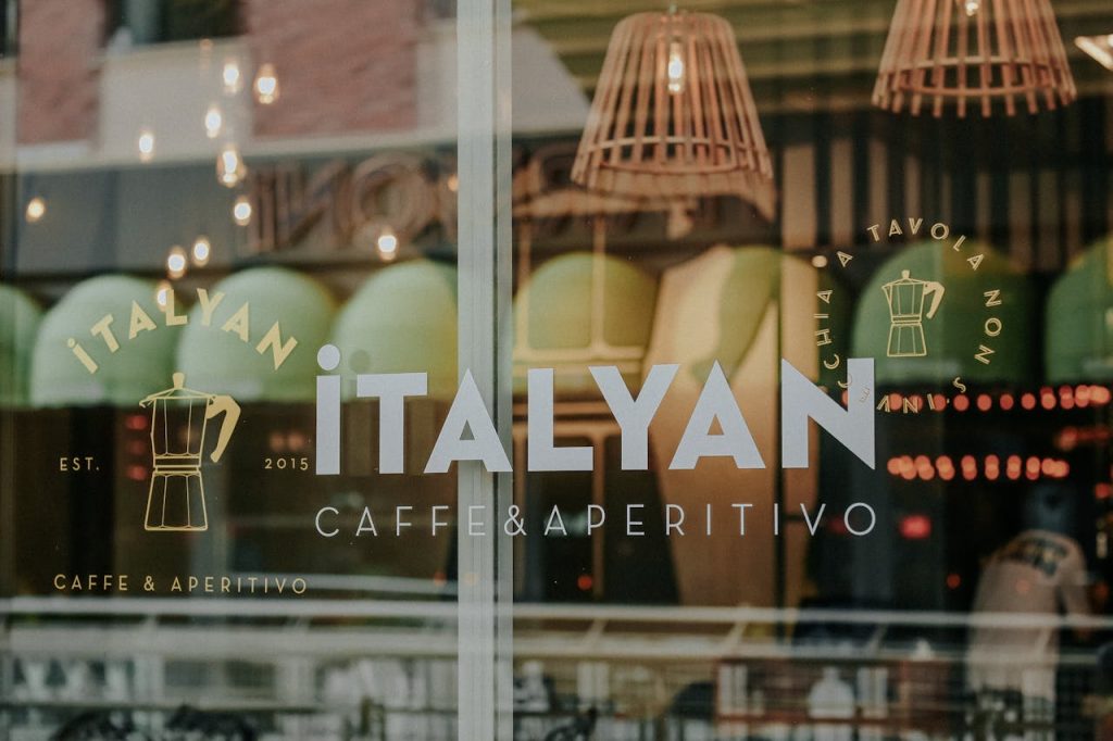
One more way to create a distinct restaurant logo is to incorporate the name of your institution. Despite the fact that restaurant names and logos are intimately related, you may create a logo based just on your business’s name. This is an especially wise choice if your restaurant is well-known for its brand, as a wordmark on signs, social media, and other marketing may assist guests in recognizing your place. The typeface you select should represent both the cuisine you offer and the ambiance you create. A high-end restaurant, for example, would almost certainly select an appealing cursive logomark. A low-key burger joint, on the other hand, would stick to print typography and color palettes.
Another crucial aspect of developing a successful restaurant brand is digital branding. Your restaurant’s website, social media, marketing emails, and any other digital presence, like your physical goods and restaurant space, should represent your branding.
Your various printable goods, from your restaurant menu design to business cards, flyers, promotional materials, takeaway containers, and everything else that a potential guest may see, should all represent your logo. This, like signs, maintains your logo constant everywhere a guest may come across it, making it more identifiable over time.
Many restaurants adopt a trendy, modern logo only to learn that it needs to be changed within a few years. As a consequence, restaurants should select a restaurant logo that is both conventional and timeless. Certain fashionable colors and typefaces, for example, are only popular for a short time and should be avoided. Instead, for memorable signs and wordmarks, turn to timeless eras such as the 1920s and 1960s. These eras continue to have an impact on the modern-day, and using them as influence may help you stand out and keep your restaurant’s logo looking beautifully timeless.
Brand logos or a combination of wordmark logos are quite popular in restaurant branding since they are the most simple and easy to remember. Restaurants have tremendous competition, so they must make the best impression possible in the least amount of time. Businesses looking for a good logo design company can benefit from font-based logos in this regard.
The use of white space uniformly in design makes the material easily scannable and considerably enhances readability. According to one research, using white space between paragraph lines and its left and right borders can boost understanding by up to 20%. Micro White Gaps are small spaces that exist between lines, paragraphs, or menu items.
Large gaps between layouts and layout components, also known as Macro White Spaces, aid in moving visitors across the website and prioritizing the user’s attention region. The screen captures from Apple.com clearly show what the website wishes to express to the user.
If you’re seeking top-tier design professionals to work on your project and create a gorgeous logo design, then you must choose a logo design specialist. Logo design professionals are not only concerned with developing unique and original logo designs but are also concerned with ensuring that your consumers are familiar with the logo.
Suggested:
8 Common Mistakes In Logo Design.
How to Pick the Right Colors for Your Logo?
Mobile applications: A powerful means to boost your brand logo.