Robin Khokhar
Robin Khokhar is an SEO specialist who mostly writes on SEO. Thus sharing tips and tricks related to SEO, WordPress, blogging, and digital marketing, and related topics.
It is expensive to print brochures and leaflets to promote your business. You can easily save money by using presentation decks instead...

Image Credits: unsplash
It is expensive to print brochures and leaflets to promote your business. You can easily save money by using presentation decks instead of printed material. Printouts are also not eco-friendly as they use paper, ink, or toner cartridges that damage the environment. Electronic presentations are not only free but are also easy to update when there are changes in business activities. Read on to find out how you can create an impressive presentation deck for your company without spending too much time or money.
Create a list of the information you need to include in the presentation. These should be related topics including financial reports, testimonials, press releases, and actions developed with data from different sources such as reports, press releases, and other documents. You can add images such as graphs and charts for a more impressive presentation.
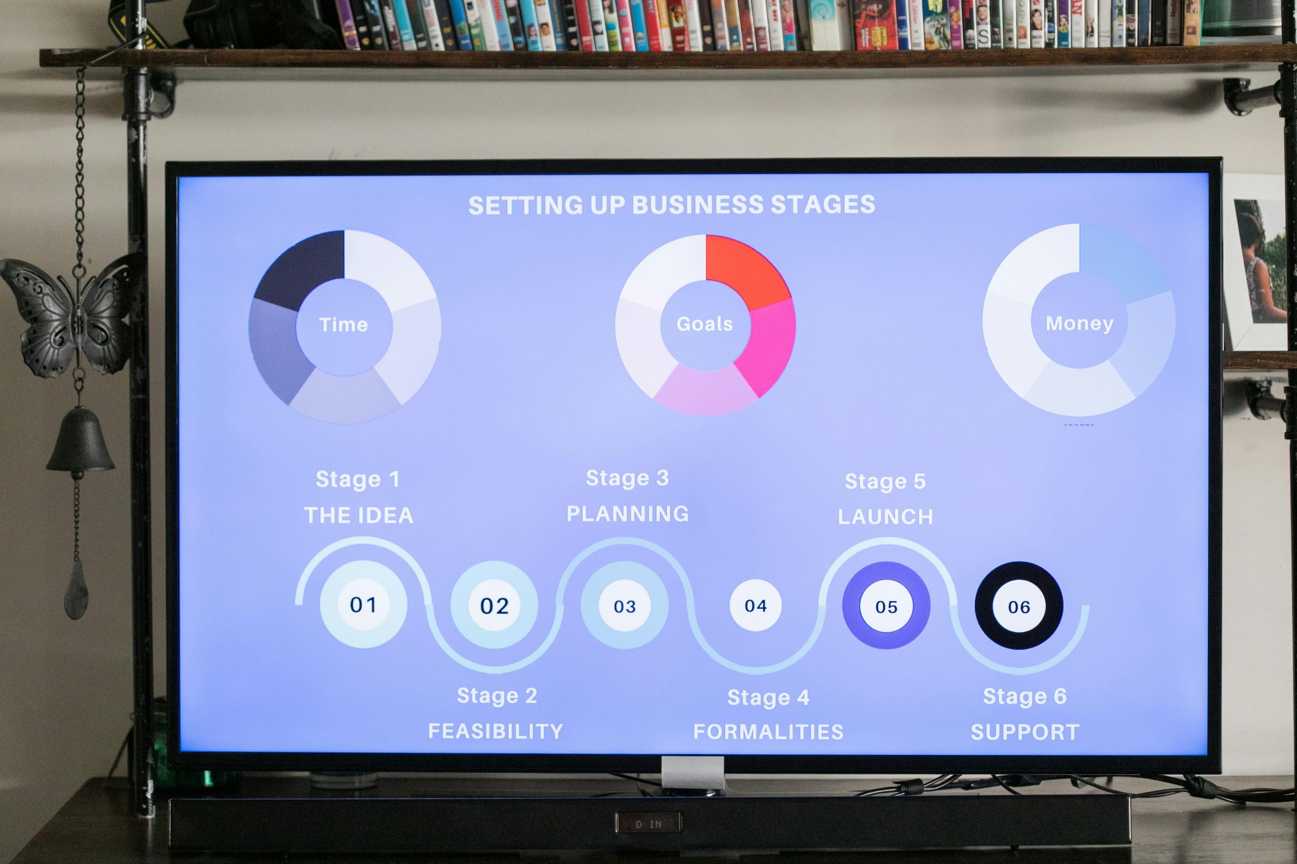
You should include slides with bold titles accompanied by explanatory text to deliver information about your company. The font style and size used should be easy to read and the content should not appear too cluttered or confusing. Have one main message in each slide to retain the interest of people who will use it for reference purposes only. Use attractive graph makers, graphs, and tables alongside graphics such as arrows, lines, or circles that enhance understanding of key points in your presentation deck.
You will be able to create new slides and add, delete, and move around content according to your needs. Use the drawing tool to add images such as graphs, tables, and diagrams. Insert video clips with audio from other databases into your presentation deck. Add hyperlinks that can direct viewers to relevant websites when they click on the links included in the presentation decks.
Venngage is an example of one that offers a wide range of presentation deck templates that will surely help you boost your image in your company. Be sure to check it out!
You should have a custom background design with bold titles in contrasting colours against the chosen background image for an impressive. Avoid using busy backgrounds that confuse viewers or have text that is too small to read. Use a light background with dark text for better visibility, particularly if no one will be giving live presentations.

You should use title slides with simple titles and explanatory information to introduce the topic covered in your presentation deck. You can include charts showing company performance accompanied by explanatory notes, graphs, tables, photos of employees, customers, or any other image related to your business activities. If there are links to various videos you have linked on your site, you can insert them as video clips rather than upload them since this saves time during the editing process.
Organize content so that there is a natural flow from one section to another. This should be done using the outline feature or by separating text and images so that it is easy to follow and understand. If you need content for your presentation, you can use data from reports and press releases as long as they contain the information you want to present. You can also create graphs, tables, or charts that summarize key points perfectly.
The font size and style should be such that people find it easy to read all the information on each page of your presentation deck. The font style should be clear and attractive enough to retain interest without making the whole content appear cluttered or chaotic. Use a single font throughout your presentation because mixing styles may make reading difficult and create confusion.
The background and font colour should be such that the content is legible and easily visible to people who will use it for reference purposes only. Use dark shades of white, grey, yellow, or other colours for the backgrounds so that the text appears crisp and easy to read. However, avoid using black to ensure visibility. Avoid using too many shades of a single colour because this could make information on several pages appear confusing.
For presentation decks with images or graphs, use bright background colours for ease of viewing. You can also add shadows and gradient effects to enhance aesthetics while retaining readability. Add graphics such as arrows to explain important points in the presentation. Use graphs, charts, and tables with text to consolidate information about your business.

Presentation decks are a great way to showcase your company’s values and culture. However, you don’t want it to be too formal or boring. First impressions are everything in business. One of the most important ways to make a good first impression is through your company’s presentation deck. For an effective presentation, you need to show off your company’s best assets and highlight what makes it stand out from the competition.
Suggested:
Create Excellent Presentations with Free PowerPoint Templates.
How to Make Appealing Presentation with Free Google Slides Templates?
Create Awesome PowerPoint Presentations with Thousands of Free Templates from SlideHunter.